CSS Box Model & Display
Reviewed & published by Brayan K
The CSS box model describes how every element is a rectangular box made of four layers — content, padding, border, and margin — and understanding how they stack and size is the key to controlling spacing and layout.
Part of the free HTML & CSS course at LearnCodingFast — hands-on lessons with examples you run in your browser, plus practice exercises and a quick quiz.
💡 Think of It Like This
Imagine a picture frame: The picture itself is the content. The matting around the picture is the padding. The frame itself is the border. And the space between the frame and the wall (or other frames) is the margin.
| Box Layer | Picture Frame Analogy | CSS Property |
|---|---|---|
| Content | The picture itself | width / height |
| Padding | The matting around the picture | padding |
| Border | The frame itself | border |
| Margin | Space between frames on the wall | margin |
The CSS Box Model
Every HTML element is a rectangular box. The box model describes how the browser calculates the total size of each element.
<!DOCTYPE html>
<html>
<head>
  <title>CSS Box Model</title>
  <style>
    body {
      background: #0f172a;
      font-family: system-ui, sans-serif;
      padding: 20px;
      color: #e5e7eb;
    }

    .box-demo {
      /* Content: 200x100 */
      width: 200px;
      height: 100px;

      /* Padding: space inside the border */
      padding: 20px;

      /* Border: the visible frame */
      border: 5px solid #3b82f6;

      /* Margin: space outside the border */
      margin: 30px auto;

      background: #1e293b;
      color: white;
      text-align: center;
      line-height: 100px;
      font-weight: bold;
    }

    .info {
      background: #1e293b;
      padding: 20px;
      border-radius: 8px;
      margin-top: 20px;
      font-size: 14px;
    }

    .info p { margin: 5px 0; }
    .label { color: #3b82f6; font-weight: bold; }

    /* Visual layered model */
    .model {
      display: flex;
      justify-content: center;
      margin: 30px 0;
    }
    .margin-layer {
      background: #f97316;
      padding: 20px;
      border-radius: 8px;
      text-align: center;
      font-size: 12px;
      color: white;
    }
    .border-layer {
      background: #3b82f6;
      padding: 15px;
      border-radius: 6px;
    }
    .padding-layer {
      background: #22c55e;
      padding: 20px;
      border-radius: 4px;
    }
    .content-layer {
      background: #8b5cf6;
      padding: 20px 30px;
      border-radius: 2px;
      font-weight: bold;
    }
  </style>
</head>
<body>
  <h1>CSS Box Model</h1>

  <div class="model">
    <div class="margin-layer">
      margin
      <div class="border-layer">
        border
        <div class="padding-layer">
          padding
          <div class="content-layer">
            CONTENT
          </div>
        </div>
      </div>
    </div>
  </div>

  <h2>Example Element</h2>
  <div class="box-demo">200 × 100</div>

  <div class="info">
    <p><span class="label">Content:</span> 200px × 100px</p>
    <p><span class="label">+ Padding:</span> 20px on each side → adds 40px width, 40px height</p>
    <p><span class="label">+ Border:</span> 5px on each side → adds 10px width, 10px height</p>
    <p><span class="label">= Total rendered size:</span> 250px × 150px</p>
    <p><span class="label">+ Margin:</span> 30px outside (doesn't affect element size)</p>
  </div>
  <!-- ✅ Expected result, measured in a real browser:
     .model -> display: flex
     .box-demo -> width: 200px
     .label -> count: 5
  -->
</body>
</html>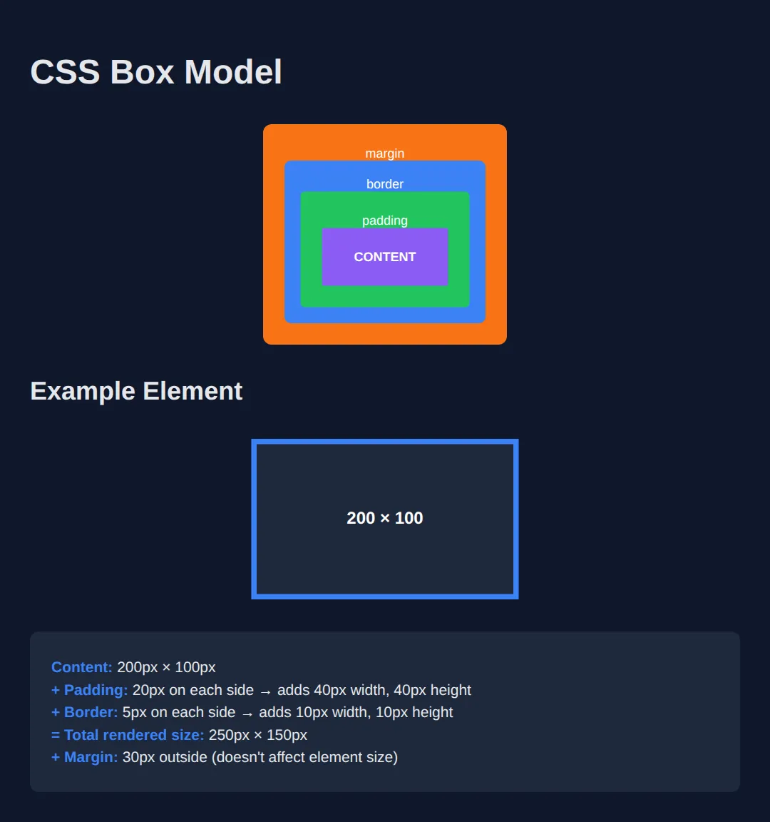
box-sizing: border-box vs content-box
By default, width only sets the content width. Padding and border are added on top, making the element bigger than you expect. box-sizing: border-box fixes this by including padding and border inside the width.
<!DOCTYPE html>
<html>
<head>
<title>box-sizing Comparison</title>
<style>
body {
background: #0f172a;
font-family: system-ui, sans-serif;
padding: 20px;
color: #e5e7eb;
}
.container {
background: #1e293b;
width: 300px;
padding: 20px;
border-radius: 8px;
margin-bottom: 20px;
}
.content-box-demo {
box-sizing: content-box; /* default */
width: 300px;
padding: 20px;
border: 5px solid #ef4444;
background: #7f1d1d;
margin-bottom: 15px;
}
.border-box-demo {
box-sizing: border-box;
width: 300px;
padding: 20px;
border: 5px solid #22c55e;
background: #14532d;
}
h3 { margin: 15px 0 5px; }
.red { color: #ef4444; }
.green { color: #22c55e; }
.info {
font-size: 13px;
color: #94a3b8;
margin-top: 5px;
}
.reference {
background: #334155;
width: 300px;
height: 4px;
border-radius: 2px;
margin: 20px 0 5px;
}
.ref-label {
font-size: 12px;
color: #94a3b8;
}
</style>
</head>
<body>
<h1>box-sizing Comparison</h1>
<div class="reference"></div>
<p class="ref-label">↑ 300px reference line</p>
<h3 class="red">content-box (default) — width: 300px</h3>
<div class="content-box-demo">
Total = 300 + 40 (padding) + 10 (border) = <strong>350px!</strong>
</div>
<p class="info">The element overflows! Padding & border are added outside the width.</p>
<h3 class="green">border-box — width: 300px</h3>
<div class="border-box-demo">
Total = exactly <strong>300px</strong> ✓
</div>
<p class="info">Padding & border are included inside the width. Much more predictable!</p>
<!-- ✅ Expected result, measured in a real browser:
.content-box-demo -> box-sizing: content-box
.border-box-demo -> box-sizing: border-box
.info -> count: 2
-->
</body>
</html>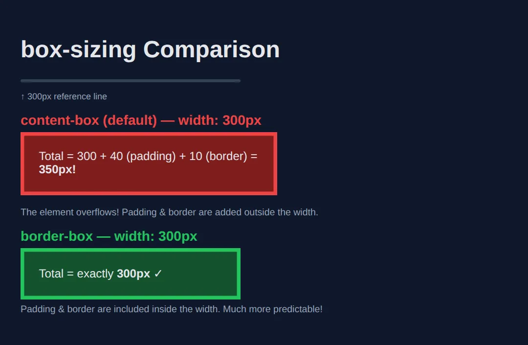
Worked Example: Predict the Width, Then Measure It
Read this one line by line before you run it. Both cards ask for exactly the same width: 400px. The only difference between them is one word — box-sizing — and that word decides how wide they actually land on the screen.
<!DOCTYPE html>
<html>
<head>
  <title>Box Model Maths</title>
  <style>
    body {
      background: #0f172a;
      color: #e5e7eb;
      font-family: system-ui, sans-serif;
      padding: 20px;
    }

    /* Shared rules. Both cards get the SAME numbers... */
    .card {
      width: 400px;                /* the number you type */
      padding: 24px;               /* 24 left + 24 right = 48px of padding */
      border: 2px solid #3b82f6;   /* 2 left + 2 right = 4px of border */
      border-radius: 8px;
      background: #1e293b;
      margin-bottom: 20px;         /* margin sits OUTSIDE - it never changes the box's own width */
    }

    /* ...and differ only here. */
    .content-box {
      box-sizing: content-box;     /* the browser's default */
      border-color: #ef4444;       /* red = the surprising one */
    }

    .border-box {
      box-sizing: border-box;      /* what you should almost always use */
      border-color: #22c55e;       /* green = the predictable one */
    }

    /* A plain 400px bar to compare both cards against by eye. */
    .ruler {
      width: 400px;
      height: 6px;
      background: #64748b;
      border-radius: 3px;
      margin-bottom: 6px;
    }
    .ruler-label { font-size: 12px; color: #94a3b8; margin: 0 0 20px; }
    h3 { margin: 0 0 8px; font-size: 15px; }
    p  { margin: 0; font-size: 14px; line-height: 1.5; }
  </style>
</head>
<body>
  <div class="ruler"></div>
  <p class="ruler-label">400px reference line</p>

  <!-- Renders 452px wide: 400 content + 48 padding + 4 border. Overshoots the ruler. -->
  <div class="card content-box">
    <h3>content-box (default)</h3>
    <p>400 + 48 + 4 = 452px on screen. Wider than the ruler above.</p>
  </div>

  <!-- Renders 400px wide: the content area shrinks to 400 - 48 - 4 = 348px instead. -->
  <div class="card border-box">
    <h3>border-box</h3>
    <p>Padding and border live INSIDE the 400. Content gets 348px.</p>
  </div>
  <!-- ✅ Expected result, measured in a real browser:
     .content-box -> box-sizing: content-box
     .border-box -> box-sizing: border-box
     .card -> count: 2
  -->
</body>
</html>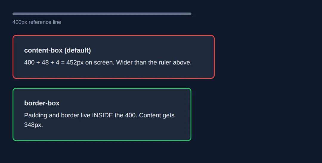
What you should see (measured in Chrome at a 900px-wide preview):
- The red card is 452px wide — it visibly sticks out past the grey 400px ruler.
- The green card is 400px wide — its right edge lines up with the ruler exactly.
- Inside the red card the content area is 400px; inside the green card it is only 348px.
Say the arithmetic out loud once and it sticks: content-box adds padding and border to your width (400 + 48 + 4 = 452), while border-box subtracts them from it (400 - 48 - 4 = 348 of content, total still 400). Margin never appears in either sum — it is space around the box, not part of it.
Gotcha: Vertical Margins Collapse Into One
Stack two blocks, give the first margin-bottom: 30px and the second margin-top: 20px, and you might expect a 50px gap. You get 30px. Touching vertical margins collapse into a single margin the size of the larger one. Padding never does this.
<!DOCTYPE html>
<html>
<head>
  <title>Margin Collapsing</title>
  <style>
    body { margin: 0; font-family: system-ui, sans-serif; }

    .blue {
      height: 40px;
      background: #3b82f6;
      margin-bottom: 30px;   /* asks for 30px below */
    }

    .orange {
      height: 40px;
      background: #f97316;
      margin-top: 20px;      /* asks for 20px above */
    }
    /* The two margins touch, so they collapse: the gap is 30px (the larger one),
       NOT 30 + 20 = 50px. The blue bar ends at y=40 and the orange starts at y=70. */

  </style>
</head>
<body>
  <div class="blue"></div>
  <div class="orange"></div>
  <!-- ✅ Expected result, measured in a real browser:
     .blue -> height: 40px
     .orange -> height: 40px
  -->
</body>
</html>
Measured result: the blue bar ends 40px down the page and the orange bar starts at 70px — a 30px gap, not 50px. Collapsing only happens between vertical margins that actually touch, so putting a border or padding between the two blocks (or making the parent a flex container) stops it.
The display Property
The display property controls how an element flows in the page. The three most common values are block, inline, and inline-block.
| Value | Takes Full Width? | Width/Height Work? | Examples |
|---|---|---|---|
| block | Yes — new line | ✅ Yes | div, p, h1–h6, section |
| inline | No — same line | ❌ No | span, a, strong, em |
| inline-block | No — same line | ✅ Yes | img, button, input |
<!DOCTYPE html>
<html>
<head>
<title>Display Property</title>
<style>
body {
background: #0f172a;
font-family: system-ui, sans-serif;
padding: 20px;
color: #e5e7eb;
}
h3 { color: #22c55e; margin: 25px 0 8px; }
.block-demo div {
display: block;
background: #3b82f6;
padding: 10px;
margin: 5px 0;
border-radius: 4px;
color: white;
}
.inline-demo span {
display: inline;
background: #8b5cf6;
padding: 5px 10px;
/* width/height ignored for inline! */
width: 200px;
height: 100px;
border-radius: 4px;
color: white;
}
.inline-block-demo span {
display: inline-block;
background: #f97316;
padding: 10px 20px;
width: 120px;
height: 60px;
border-radius: 4px;
color: white;
text-align: center;
line-height: 40px;
}
.note {
color: #94a3b8;
font-size: 13px;
margin-top: 8px;
}
</style>
</head>
<body>
<h1>CSS Display Property</h1>
<h3>display: block</h3>
<div class="block-demo">
<div>Block A — takes full width</div>
<div>Block B — starts new line</div>
<div>Block C — stacks vertically</div>
</div>
<p class="note">Each block element takes the full width and starts a new line.</p>
<h3>display: inline</h3>
<div class="inline-demo">
<span>Inline A</span>
<span>Inline B</span>
<span>Inline C</span>
</div>
<p class="note">Inline elements sit side by side. Width & height are IGNORED!</p>
<h3>display: inline-block</h3>
<div class="inline-block-demo">
<span>120×60</span>
<span>120×60</span>
<span>120×60</span>
</div>
<p class="note">Inline-block: sits side by side BUT respects width & height. Best of both!</p>
<!-- ✅ Expected result, measured in a real browser:
.block-demo div -> display: block
.inline-demo span -> display: inline
.inline-block-demo span -> display: inline-block
.note -> count: 3
-->
</body>
</html>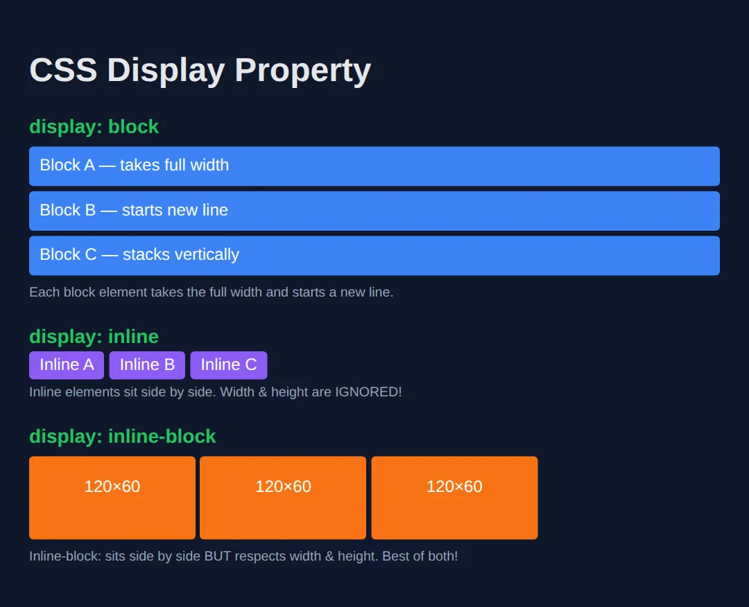
🎯 Your Turn: Make Three Tags Exactly 160 × 60
Everything below is written for you except the three declarations this lesson is about. Fill in each ___, run it, then check your result against the expected output in the comment.
<!DOCTYPE html>
<html>
<head>
  <title>Your Turn: Skill Tags</title>
  <style>
    body {
      background: #0f172a;
      color: #e5e7eb;
      font-family: system-ui, sans-serif;
      padding: 20px;
    }

    /* 🎯 YOUR TURN — replace each ___ below. Everything else already works. */
    .tag {
      /* 👉 1) These are <span> elements, so by default they are inline and
             ignore width and height. Pick the display value that keeps them
             side by side BUT makes width and height work. */
      display: ___;

      /* 👉 2) Pick the box-sizing value that makes "width" mean the FULL
             width on screen, padding and border included. */
      box-sizing: ___;

      width: 160px;                /* target size... */
      height: 60px;                /* ...that you must actually hit */

      /* 👉 3) Give the text 18px of breathing room on all four sides. */
      padding: ___;

      border: 3px solid #22c55e;
      border-radius: 999px;        /* 999px = a pill shape */
      background: #14532d;
      text-align: center;
      margin-right: 8px;
    }

    /* ✅ Expected result: three green pill-shaped tags sitting on ONE line.
       Right-click a tag > Inspect and the box model panel reads exactly
       160 x 60.

       If a tag measures 202 x 102, blank 2 is still content-box (160+36+6).
       If the tags shrink to fit their text and ignore your sizes, blank 1 is
       still inline. */
  </style>
</head>
<body>
  <h1>Skill tags</h1>

  <span class="tag">HTML</span>
  <span class="tag">CSS</span>
  <span class="tag">Layout</span>
</body>
</html>
display: inline-block;
box-sizing: border-box;
padding: 18px;🏆 Mini-Challenge: The 320px Pricing Card
No blanks this time — just a brief and an outline. Build a pricing card that stays exactly 320px wide however much padding you give it, centred in the page, with three small stat pills across the bottom sitting on one line.
<!DOCTYPE html>
<html>
<head>
  <title>Mini-Challenge: Pricing Card</title>
  <style>
    /* 🎯 MINI-CHALLENGE — write the rules yourself. No answers below.

       1. Reset the box model for every element:
          *, *::before, *::after  ->  box-sizing: border-box;

       2. .price-card  ->  width 320px, padding 24px, 2px solid border,
                           border-radius 12px, a dark background

       3. .price-card  ->  margin: 0 auto;   (this is what centres it)

       4. .stat        ->  display: inline-block, width 80px, height 44px,
                           padding 12px, a 1px border, margin-right 4px

       ✅ Check yourself in DevTools:
          - .price-card must measure exactly 320px wide.
            If it reads 372px, step 1 is missing (320 + 48 padding + 4 border).
          - all three .stat pills must sit on the SAME line.
            If the third one drops to a new line, they are too wide for the
            card's 272px of inner space (320 - 48 of padding).
    */
  </style>
</head>
<body>
  <div class="price-card">
    <h2>Pro</h2>
    <p>£12 / month</p>

    <span class="stat">10 GB</span><span class="stat">5 users</span><span class="stat">24/7</span>
  </div>
</body>
</html>
Note the HTML above deliberately has no line breaks between the three <span> tags. Inline-block elements are affected by whitespace in your source, so a newline between them adds a few extra pixels of gap — enough to push the third pill onto a second line here.
⚠️ Common Mistakes
- Forgetting box-sizing: border-box — Without it, padding and border make elements larger than the width you set. Always add *, *::before, *::after { box-sizing: border-box; } to your CSS.
- Setting width/height on inline elements — span and a ignore width and height. Use display: inline-block or display: block first.
- Collapsing margins — When two vertical margins touch, they collapse into one (the larger value wins). This doesn't happen with padding.
- Using margin for internal spacing — Use padding for space inside an element; use margin for space between elements.
🎉 Lesson Complete
You now understand the CSS box model — the foundation of every layout on the web. Key takeaways:
- ✅ Every element has content → padding → border → margin
- ✅ Use box-sizing: border-box for predictable sizing
- ✅ block = full width + new line; inline = flows in text; inline-block = best of both
- ✅ Padding = space inside; Margin = space outside
Practice quiz
What are the four layers of the CSS box model, from inside to outside?
- margin, border, padding, content
- content, padding, border, margin
- content, margin, border, padding
- padding, content, margin, border
Answer: content, padding, border, margin. From the inside out: content, then padding, then border, then margin.
Which box layer is the space INSIDE the border, between content and border?
- margin
- padding
- border
- content
Answer: padding. Padding is the space inside the border surrounding the content; margin is the space outside the border.
Which box layer is the space OUTSIDE the border, between this element and others?
- padding
- content
- margin
- border
Answer: margin. Margin is the space outside the border separating the element from its neighbours.
With the default box-sizing: content-box, what does the width property set?
- The content width only — padding and border are added on top
- The total rendered width including padding and border
- Only the border width
- The margin width
Answer: The content width only — padding and border are added on top. In content-box, width sets just the content; padding and border are added outside it, making the element larger than the width value.
An element has width: 300px, padding: 20px, and a 5px border, with the default content-box. What is its total rendered width?
- 300px
- 325px
- 350px
- 340px
Answer: 350px. 300 + 40 (20px padding each side) + 10 (5px border each side) = 350px in content-box.
What does box-sizing: border-box do?
- Adds padding and border outside the width
- Includes padding and border inside the declared width
- Removes the border entirely
- Doubles the element's width
Answer: Includes padding and border inside the declared width. border-box includes padding and border inside the width, so a width: 300px element renders at exactly 300px — far more predictable.
How does a display: block element behave?
- Sits on the same line as other elements and ignores width/height
- Takes the full width available and starts on a new line
- Flows inside text and respects width/height
- Is removed from the layout
Answer: Takes the full width available and starts on a new line. Block elements (div, p, h1–h6, section) take full width and stack vertically on new lines.
What happens when you set width and height on a display: inline element like a span?
- They apply normally
- They are ignored
- They double in size
- The element becomes a block
Answer: They are ignored. Inline elements (span, a, strong, em) ignore width and height and flow within text.
Which display value sits elements side by side BUT still respects width and height?
- block
- inline
- inline-block
- none
Answer: inline-block. inline-block flows on the same line like inline but honours width and height like block — the best of both.
What is margin collapsing?
- Two adjacent vertical margins combine into one (the larger value)
- Padding turning into margin
- Borders overlapping
- Margins being ignored on inline elements
Answer: Two adjacent vertical margins combine into one (the larger value). When two vertical margins touch they collapse into a single margin equal to the larger value. Padding does not collapse.
Continue this course
- Previous: CSS Styling & Colors
- Next: CSS Layouts & Box Model — Combine display, position, and the box model to build real layouts
- Quick reference: HTML & CSS cheat sheet › CSS Box Model